Making everyday banking feel human again
A new identity and mobile app for a challenger bank that wanted to win back people who had quietly given up on their bank.
- Client
- Fernwood
- Year
- 2026
- Timeline
- 22 weeks
- Services
- Brand strategy & identity
- Websites & e-commerce
- Digital products
The challenge
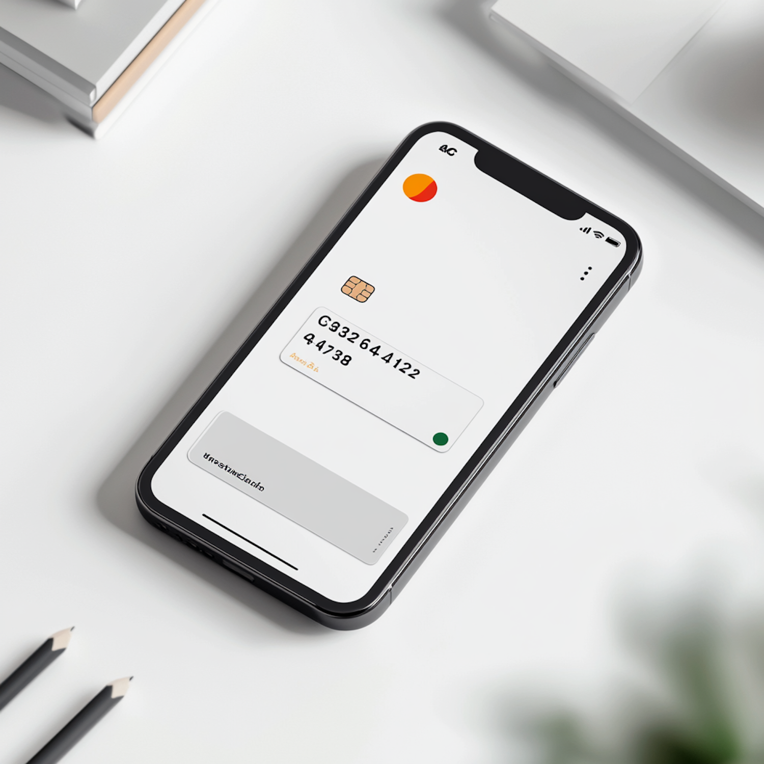
Fernwood had the licence, the product and a loyal early following, but its brand looked like every other neobank: gradients, coins and a mascot nobody remembered. Our research showed that the people it most wanted to reach did not distrust banks because of fees. They distrusted them because nothing was ever explained plainly. The brand had to earn that trust before it could ask anyone to sign up.

Our approach
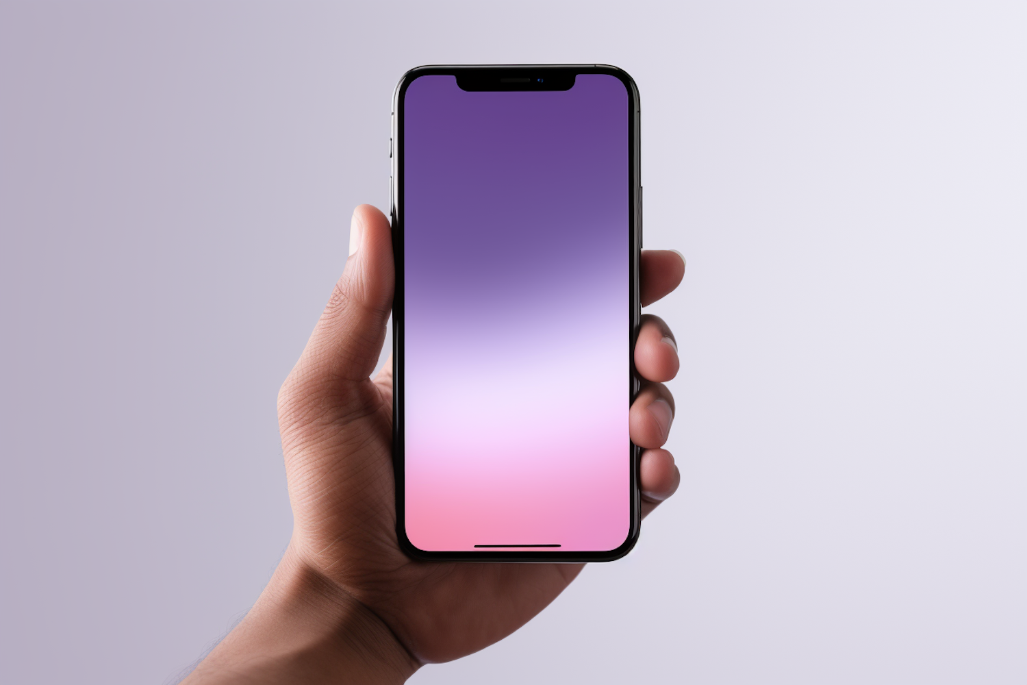
We built the identity around a single idea, plain speaking, and let it shape everything from the names of the accounts to the motion in the app. A warm, editorial type system replaced the usual tech tropes, and one deep green carries through cards, statements and screens. Inside the app we rewrote every flow in everyday language, cut onboarding from eleven screens to four and designed a home screen that answers one question first: am I okay this month?
The outcome
The new brand launched alongside version two of the app. Within six months Fernwood had more than doubled its customer base, new customers were opening accounts in minutes, and support tickets about confusing screens dropped sharply.
- Customer growth in six months
- 2.4x
- Average time to open an account
- 4 min
- Fewer support tickets about the app
- 38%
Arcline gave us a voice before they gave us a logo. Our customers notice the difference every single day.
Priya Natarajan
Chief Executive, Fernwood